Portfolio > New vision for a flagship mobile app
Project TL;DR
Why it mattered
😢 Years of investment wasn’t paying off for UPMC Health Plan’s member app
🔁 Returning visitors jumped and abandonment dropped after the app’s relaunch
📈 2x to 7x increases in searches, live chats, and feedback
What it highlights
🏆 How I championed and socialized a project to “sell” it within the organization
📱 Ownership of all product UX decisions, and experience designing for mobile
🤝 Co-creation with cross-functional teammates and SMEs to fuel ideation
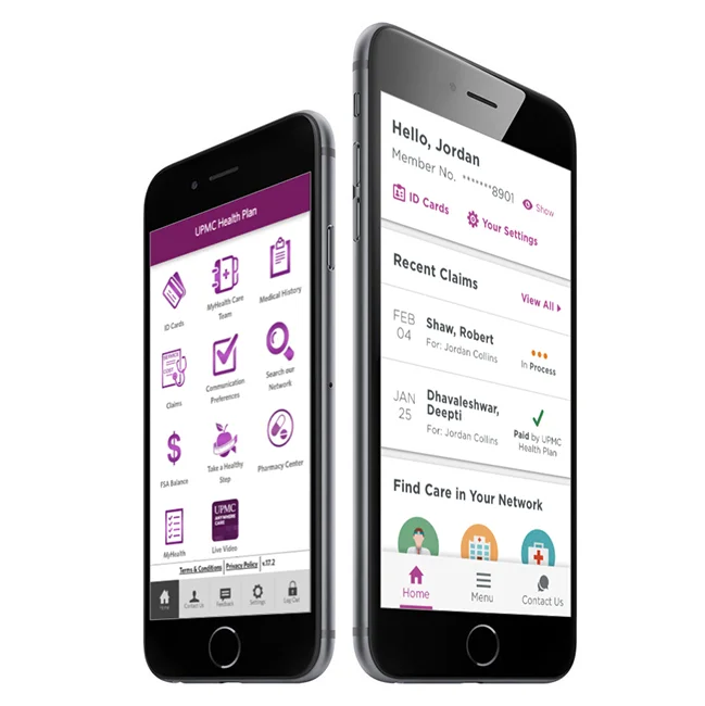
Before, on the left. And after, on the right.
Challenge
Very early on, this concept poster was created to communicate ideas about what a re-architecture could mean for the app and its users. It was displayed around our floor and in the office of our senior director, often stirring and giving focus to conversations.
UPMC Health Plan’s member app was failing the expectations of both its users or business stakeholders.
Too many users would log in once and never return.
Important information was buried and disjointed.
There was nowhere to add functionality or content without overcrowding the home screen's "junk drawer."
People asked for features that actually existed but couldn’t be found. “I wanna be able to chat with someone,” one member told us, although live chat with Member Services was in the app.
To shift the app's UX and prime it for innovative growth, I believed we needed to start by revamping the structures for its organization, navigation, and home screen.
Process
As the app’s lead designer, I made the case in conversations, in illustrative visuals, and in IA research.
A series of card sorts and tree tests revealed people's mental models of our content.
Insight: We had been dividing our content between categories of “coverage and benefits” and “claims and spending,” but people didn’t grasp that distinction. All they saw was a single bucket of insurance jargon.
Playing with ways of organizing before another card sort.
Using a do-go map to see the flows within proposed structures.
Kicked off the project collaboratively with design, product management, engineering, and QA. During workgroups I facilitated with colleague Larissa Jantonio, the team forged a shared understanding of what we were doing and why.
Excerpt from the project brief, synthesized with the materials produced and discussed during our kickoff sessions.
Another project brief excerpt. It was important to me that everyone could see how collaborative this was, and that teammates could see contributions in action.
Concept ideation and refinement was then driven based on design principles.
I oversaw all interaction design decisions while contributing to visual and motion design choices.
With a project like this one, I knew we needed to get feedback from stakeholders and SMEs yet avoid derailment by any single stakeholder’s personal tastes. I presented our concept reviews as critique sessions, which allowed stakeholders (without being design experts) to focus on what they knew best and help us improve our ideas.
I orchestrated and contributed to planning and execution of usability research that would test key components. We found a few places where language needed revision, where affordances needed to be more obvious. But overall, we were on the right track.
In one of our validation studies, participants were asked what they liked about our changes to the app. To which one person answered: “Everything, and don't let who came up with this version be fired!” 😄
My collaborators
Alexis Miller [Product manager], Himen Patel [Business analyst], Srikanth Chinthakindi [Engineer], Larissa Jantonio [Designer], Marya Markovich [Scrum master], Roman Velykodanov [Engineer], Vladimir Shelogurov [QA], Mour Diop [Engineer]
My contributions
Content strategy, Documentation, Facilitation, Information architecture, Interaction design, Prototyping, Stakeholder critiques, UX strategy, Usability testing, User research, Visual design
Outcomes
In the 5 months after launch compared to the 5 months before:
1.8 times the number of sessions per user
15-point jump in the percentage of people using the app more than once a month
Percentage of single-visit users reduced to to 8% from 14%
3.5x increase in live chat sessions with Member Services
Twice the number of doctor searches
80–100 monthly submissions of in-app feedback received from users, with previous average of 10–15
Taken together, these metrics signaled that we truly made the app more useful and meaningful to our members’ lives.