Portfolio > Upgrade moments for a freemium plan
Project TL;DR
What it highlights
💎 An approach to content design that starts with defining goals
🤝 How I facilitated cross-functional alignment among a group of designers, marketers, and product leaders
💬 How I collaboratively shared solutions, invited participation, and converged on solutions
Why it mattered
🎯 Mural’s new freemium plan was central to company OKRs and customer expansion strategies
⚖️ Upgrade prompts in product required a thoughtful balance of customer and business needs
🤑 $90,000 in new revenue generated after 5 weeks of launch
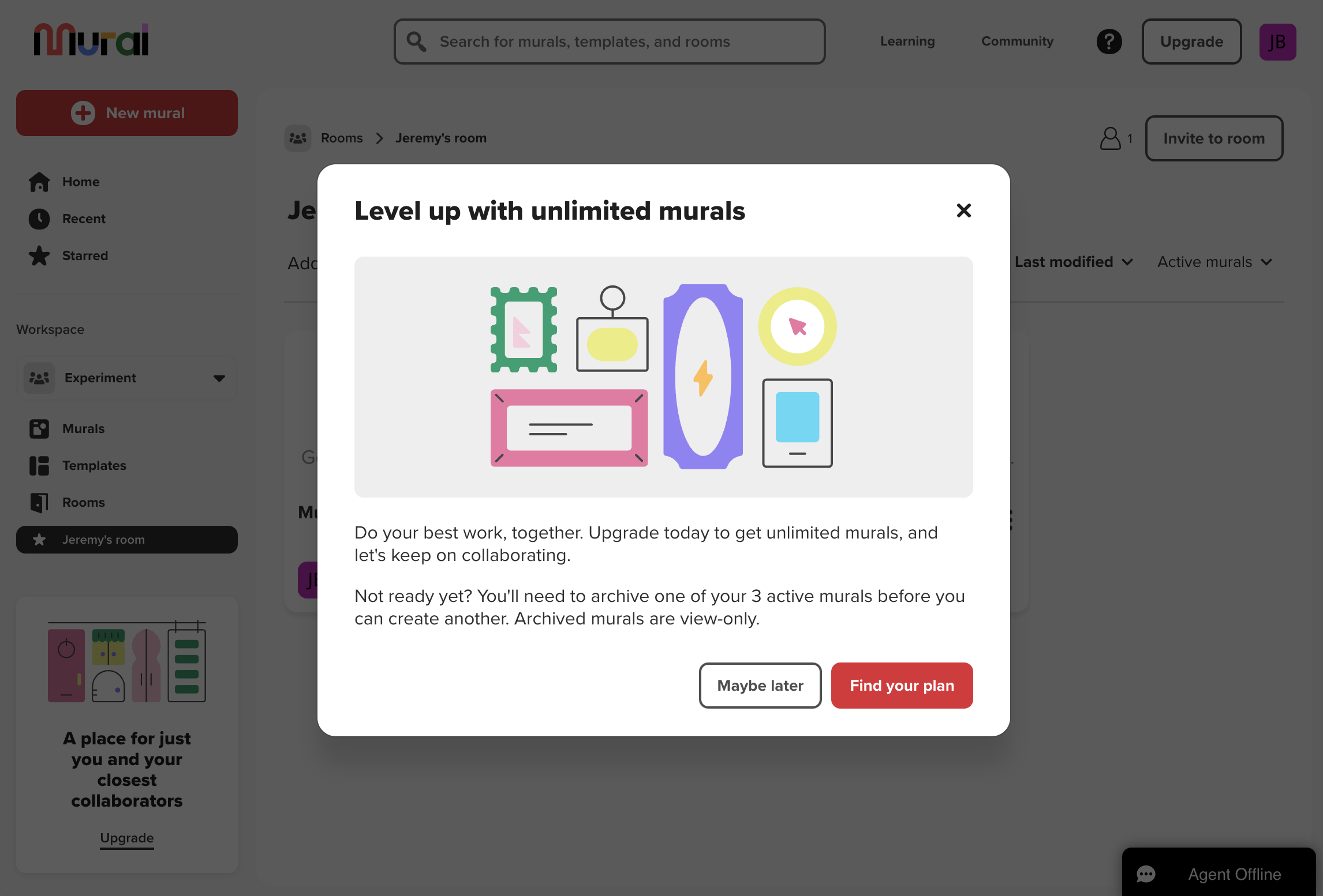
Prompt to upgrade after reaching a limit. This experience looked a bit different at launch … but it’s still the same final content.
Challenge
Mural, a digital whiteboard and collaboration company, was overhauling its pricing plans and acquisition strategies. And in a month, a new freemium plan would launch with feature limits and triggers meant to convert free users into paying customers. As lead content designer, I was asked to provide messaging.
Messaging needed to encourage upgrades by people who valued Mural while not pushing away users who, for whatever reason, weren’t yet ready to buy.
How would that messaging embody Mural’s developing voice, and express itself consistently through the journey of marketing and product experiences?
High-profile nature of the project meant hands-on involvement from executive stakeholders with lots of ideas and opinions.
Process
Joining the project in flight, I soaked up existing briefs and artifacts, and met with the leading designer to review the flows so far.
I realized it would be critical to establish shared understanding and goals among the diverse set of cross-functional stakeholders, at all levels. So I advocated for a working session that would include directors along with working team members.
Using a series of structured activities, I facilitated discussion about the content’s goals and our voice and tone profile. Synthesizing as we went, I helped the group further define what success would look like:
After voting and group writing exercises, we emerged with a clear set of priorities and raw material for exploration.
From there, I started to play with ideas and share them for early feedback with the core working team:
This led to 3 refined directions for the most important of the upgrade moments. Again I elicited feedback, most of it asynchronously.
I frequently pointed us back to our shared goals and voice profile, evaluating decisions and options through those lenses. I asked questions of Product Management to refine how we communicated value propositions, and of Marketing to check how our messaging would complement their work and larger Mural brand narratives:
My collaborators
Jesse Feldman [Product marketer], Taylor LeCroy [Product designer], Murali Kundasi [Product manager], Kevin Rupert [Product designer], Lauren Schuman [Product director], Aaron Fernandez [Visual designer], Michel Pigassou [Engineering manager]
My contributions
Project facilitation, Voice and tone, UX writing, Content strategy, Microcopy, Content system guidelines
Outcomes
Buy-in and seamless approvals from executive stakeholders. Working session had established trust and got everybody on the same page.
Visuals, interactions, and content that all complemented each other in a set of upgrade moments designed holistically.
$90,000 in new revenue generated after 5 weeks of launch.
Guidelines established and further developed, both for brand voice and our modal UI component.
Reflections
Looking at the content now, I see where it could’ve been sharper. And it was designed for a specific arrangement with a different visual, but that changed and I think the result doesn’t hold together as well. Lessons in context, iteration, and ownership.
Wish we’d been able to follow up with performance monitoring and testing of different variants.
“Level up” now feels overdone and hollow, but at the time it fit with brand themes.
It’s such a simple yet powerful thing to elicit feedback with structure — ”I like…” “I’m uncertain about…” “I wonder…”