What
A content design challenge across 2 audiences and 2 new features for a linchpin of Watson Assistant’s channel strategy. Everyone was stuck. But with cross-functional collaboration and the right research, our UX writing helped change that.
Highlights
New suggestions feature exceeded initial adoption goal by 56%
2x engagement with a new quick start feature, whose usage has increased week over week
Trust built with cross-functional teammates. Said one senior developer: “Thank you so much for sharing your thought processes throughout this, rather than just saying ‘do this.’ It’s been a real pleasure.”
My Collaborators
Cat Fincun [UX designer], Nina Shahriaree [Visual designer], Adam Benvie [Product manager], Arnesh Batlaw [Product manager], Ethan Winters [Developer], Michelle Miller [Docs writer], Reed Campbell [Researcher]
My Contributions
Accessibility, Information architecture, Microcopy, Naming and labeling, UX writing, User research, Voice and tone
Why
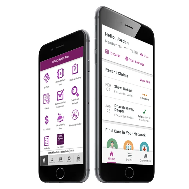
Watson Assistant’s web chat — a widget for adding an intelligent chatbot to any website — is a linchpin of the product’s long-term strategy. Yet when clients deployed web chat, their customers would get stuck. Some stumbled at the very start, opening the chat but never sending messages. Others got stuck in the middle, frustrated by dead ends in conversation.
Two new features, developed in parallel, were conceived to fix these pain points. A home screen would offer a quick start, while another feature dubbed “quick escape” would present dynamic options to keep the conversation moving.
As the content design lead, I supported both feature teams. How could we introduce these features to Watson Assistant’s users so that they’d be immediately understood? What might convey the value of adoption? Did “quick escape” need a name different from its moniker that’d taken root internally? And in the end, how would any of these decisions align with what clients’ customers experienced in the chat, so that it would be clear, engaging, and relevant?
Watson Assistant’s web chat, as seen on ct.gov.
How
Both assignments started where I so frequently start content assignments: forging shared sense of objectives and what “good” outcomes would be.
For the hot-button naming of “quick escape,” this meant facilitating a working session with the cross-functional team to discuss and prioritize criteria. This exercise revealed ways that people were thinking about the feature, and it surfaced a requirement for a11y-friendliness because of how people using screen readers would use the feature.
Excerpt from an activity to align on criteria.
Meanwhile for the home screen, similar discussions led to an audit of draft copy and IA-related considerations. I reviewed labels and headings, questioned placements and inclusions, framed up options to explore. And then collaboratively with a visual designer, developer and product manager, we converged on low-hanging fruit and ideated where more exploration was needed.
Auditing of draft material for the home screen, both what would display to Watson Assistant users and clients’ customers.
With the naming of “quick escape,” ideation meant rounds of brainstorming that yielded 133 potential variations. Because the team had churned on a name for some time, I sought to make the decision evidence-based; the effectiveness of our words could be reasoned and researched, like any design element. Using our criteria, we narrowed to 6 finalist names. I then coordinated user studies, including a round with vision-impaired participants whose inclusion was critical to our need for accessibility. We recruited more than 80 people for scenario-based content testing activities, the results of which made clear that “quick escape” was confusing and negatively perceived. Goodbye “quick escape,” hello “suggestions”!
Brainstorming naming alternatives.
And evaluating leading contenders against criteria.
A glimpse of the research activity that I conceived, set up, and conducted.
Results, focused on comprehension and expectations, that steered us toward “suggestions.”
More results in favor of “suggestions,” these focused on attitudes and emotional perception.
I triangulated research findings with exercises to play with different copywriting in context, to see how variations held up or aligned with objectives. Along the way, I presented progress at sprint demos and engaged product leadership in our recommendations.
With naming settled, we could finalize the content within Watson Assistant where users would find web chat’s home screen and suggestions. I drafted and redrafted, incorporating feedback from design teammates and others. And ensuring I groked the technical underpinnings to write with accuracy, I was empowered to guide us through trade-offs and nudge us toward more value-based ways of communicating these features. All while weighing how things experienced by customers would sound and be perceived.
The result was clearer, cleaner, more meaningful content that bolstered the success of both features’ beta releases and their OKRs.
